King Street Artworks tutors and artists in front of colourful new building façade. PHOTO/ERIN KAVANAGH-HALL
Erin Kavanagh-Hall
For the King Street Artworks (KSA) whanau, the studio’s brand new building façade represents its very best qualities: colourful, connected, welcoming and inclusive.
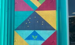
Last week, the community art space hosted an intimate gathering to celebrate the latest additions to its Queen Street premises: a series of contemporary tukutuku panels, the handiwork of KSA’s tutors and artists.

Members of the KSA community met on Wednesday morning for an informal opening ceremony, where the newly installed panels received a blessing from Maori art tutor Jenny Katene-Morgan.
Also acknowledged were the building’s new signage, painted by studio manager Linda Tilyard, and KSA’s recently refurbished gallery – where artists regularly display their work.
Now in its 25th year, KSA’s kaupapa is to help improve community health and wellbeing through creativity – offering a space for people to try various art mediums in a relaxed and supportive environment.
Tutor Katene-Morgan said the studio’s new frontage had been a project several years in the planning — with the artists keen to create a design that would give the premises a distinct identity.
Tutors asked the artists to write down the words that came to mind when they thought of KSA.
KSA attendees contributed phrases like “aroha”, “whanaungatanga” (relationships), “whanau”, “feeling safe”, and the freedom to “come and go” as they chose.
These words inspired the design for the panels – which were painted by staff using a vivid color scheme of turquoise, deep blue, yellow and hot pink.
“It was very much a collaborative effort,” Katene-Morgan said.
“The panels represent us as an organisation: vibrant, open minded, and creative. We want people to look at our building and feel joy – and for it to spark a conversation.
“It helps our space to stand out. I feel overwhelmed to see the panels completed – but very happy.”
In Maoridom, Katene-Morgan explained, tukutuku panelling decorates the outside of marae — their designs representative of the area and its people.
KSA’s panels use multiple chevron and diamond patterns: forming hearts to symbolise the aroha within its community, and arrows representing artists’ freedom of movement.
The designs also capture the seven stars of Matariki, the ocean, and Wairarapa’s landscape, such as its mountains, forests and rivers.
“It all represents the essence of KSA,” Katene-Morgan said.
“For example, we celebrate Matariki as a studio every year. A lot of our artists feel a real connection with the sea and our rivers – being near the water is part of their wellbeing.
“Others find going for walks in the forest is good for their mental health.”
The panels are an ideal complement to the building’s signage — which uses saturated colours (pink on a teal background) and bold lines, inspired by the pop art movement of the 1950s.
Studio manager Linda Tilyard designed the signage, again with input from artists
“I asked our artists what KSA meant to them, and the words that kept coming up were ‘accessible’ and ‘inclusive’”, she said.
“Pop art was intended to be accessible to everyone – rather than fine art, which could be elitist and hard to grapple with.
“That sums up KSA: we go out of our way to be accessible.”
Studio coordinator Ian Chapman said he was thrilled with the new frontage — which can be seen “from a mile away”.
“The building really does pop. It’s definitely moved away from that corporate look: it’s unique, it’s bright, it’s bubbly, and still has that homemade feel, which we love.”
Chapman said KSA is planning “several celebrations” for its 25th anniversary in June – covid permitting.


